LEARN ABOUT DIFFERENT ANDROID VERSIONS
Android is a mobile operating system developed by Google, based on a modified version of the Linux kernel and otheropen source software and designed primarily for touchscreen mobile devices such as smartphones and tablets. In addition, Google has further developed Android TV for televisions, Android Auto for cars, and Wear OS for wrist watches, each with a specialized user interface. Variants of Android are also used on game consoles, digital cameras, PCs and other electronics
Android versions 1.0 to 1.1: The early days
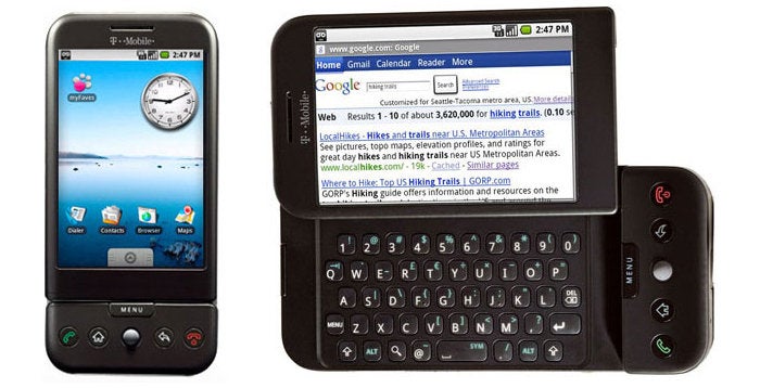
Android made its official public debut in 2008 with Android 1.0 — a release so ancient it didn't even have a cute codename.
Things were pretty basic back then, but the software did include a suite of early Google apps like Gmail, Maps, Calendar and YouTube, all of which were integrated into the operating system — a stark contrast to the more easily updatable standalone-app model employed today.
Android version 1.5: Cupcake
With early 2009's Android 1.5 Cupcake release, the tradition of Android version names was born. Cupcake introduced numerous refinements to the Android interface, including the first on-screen keyboard — something that'd be necessary as phones moved away from the once-ubiquitous physical keyboard model.
Cupcake also brought about the framework for third-party app widgets, which would quickly turn into one of Android's most distinguishing elements, and it provided the platform's first-ever option for video recording.
Android version 1.6: Donut
Android 1.6, Donut, rolled into the world in the fall of 2009. Donut filled in some important holes in Android's center, including the ability for the OS to operate on a variety of different screen sizes and resolutions — a factor that'd be critical in the years to come. It also added support for CDMA networks like Verizon, which would play a key role in Android's imminent explosion.
Android versions 2.0 to 2.1: Eclair
Keeping up the breakneck release pace of Android's early years, Android 2.0 Eclair, emerged just six weeks after Donut; its "point-one" update, also called Eclair, came out a couple months later. Eclair was the first Android release to enter mainstream consciousness thanks to the original Motorola Droid phone and the massive Verizon-led marketing campaign surrounding it.
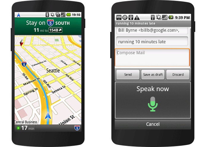
The release's most transformative element was the addition of voice-guided turn-by-turn navigation and real-time traffic info — something previously unheard of (and still essentially unmatched) in the smartphone world. Navigation aside, Eclair brought live wallpapers to Android as well as the platform's first speech-to-text function. And it made waves for injecting the once-iOS-exclusive pinch-to-zoom capability into Android — a move often seen as the spark that ignited Apple's long-lasting"thermonuclear war" against Google.
Android version 2.2: Froyo
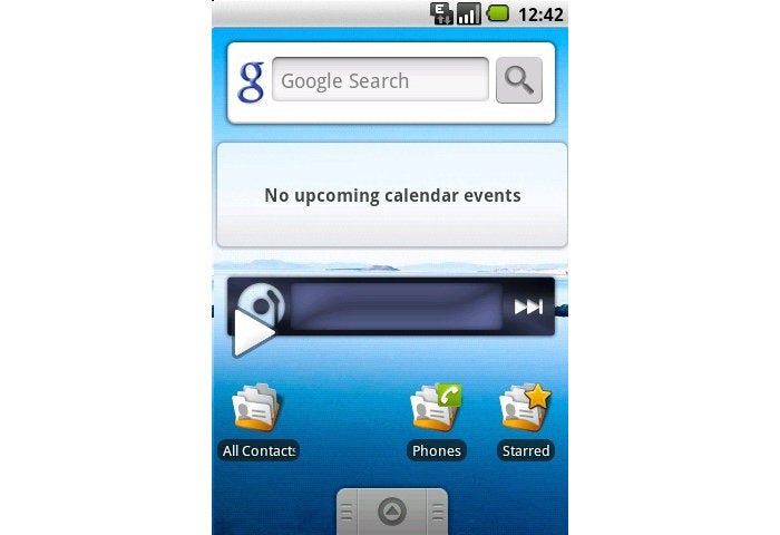
Just four months after Android 2.1 arrived, Google served up Android 2.2, Froyo, which revolved largely around under-the-hood performance improvements.
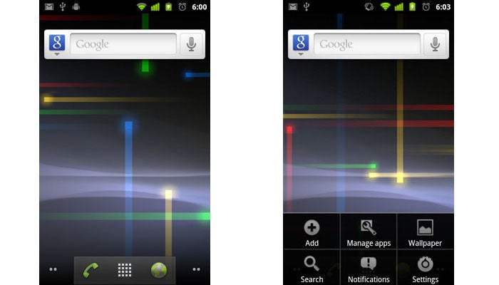
Froyo did deliver some important front-facing features, though, including the addition of the now-standard dock at the bottom of the home screen as well as the first incarnation of Voice Actions, which allowed you to perform basic functions like getting directions and making notes by tapping an icon and then speaking a command.
Notably, Froyo also brought support for Flash to Android's web browser — an option that was significant both because of the widespread use of Flash at the time and because of Apple's adamant stance against supporting it on its own mobile devices. Apple would eventually win, of course, and Flash would become far less common. But back when it was still everywhere, being able to access the full web without any black holes was a genuine advantage only Android could offer.
Android version 2.3: Gingerbread
Android's first true visual identity started coming into focus with 2010's Gingerbread release. Bright green had long been the color of Android's robot mascot, and with Gingerbread, it became an integral part of the operating system's appearance. Black and green seeped all over the UI as Android started its slow march toward distinctive design.
Android 3.0 to 3.2: Honeycomb
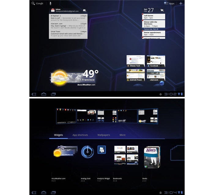
2011's Honeycomb period was a weird time for Android. Android 3.0 came into the world as a tablet-only release to accompany the launch of the Motorola Xoom, and through the subsequent 3.1 and 3.2 updates, it remained a tablet-exclusive (and closed-source) entity.
Under the guidance of newly arrived design chief Matias Duarte, Honeycomb introduced a dramatically reimagined UI for Android. It had a space-like "holographic" design that traded the platform's trademark green for blue and placed an emphasis on making the most of a tablet's screen space.
While the concept of a tablet-specific interface didn't last long, many of Honeycomb's ideas laid the groundwork for the Android we know today. The software was the first to use on-screen buttons for Android's main navigational commands; it marked the beginning of the end for the permanent overflow-menu button; and it introduced the concept of a card-like UI with its take on the Recent Apps list.
Android version 4.0: Ice Cream Sandwich
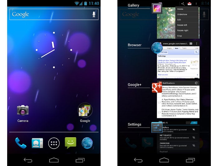
With Honeycomb acting as the bridge from old to new, Ice Cream Sandwich — also released in 2011 — served as the platform's official entry into the era of modern design. The release refined the visual concepts introduced with Honeycomb and reunited tablets and phones with a single, unified UI vision.
ICS dropped much of Honeycomb's "holographic" appearance but kept its use of blue as a system-wide highlight. And it carried over core system elements like on-screen buttons and a card-like appearance for app-switching.
Android 4.0 also made swiping a more integral method of getting around the operating system, with the then-revolutionary-feeling ability to swipe away things like notifications and recent apps. And it started the slow process of bringing a standardized design framework — known as "Holo"— all throughout the OS and into Android's app ecosystem.
Android versions 4.1 to 4.3: Jelly Bean
Spread across three impactful Android versions, 2012 and 2013's Jelly Bean releases took ICS's fresh foundation and made meaningful strides in fine-tuning and building upon it. The releases added plenty of poise and polish into the operating system and went a long way in making Android more inviting for the average user.
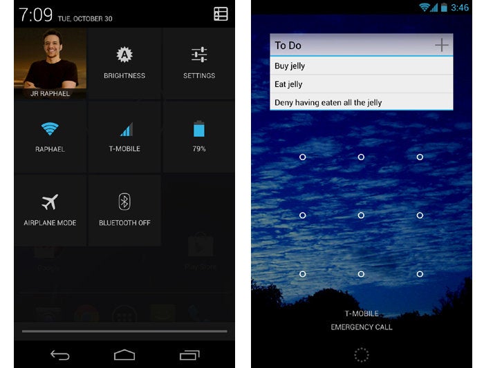
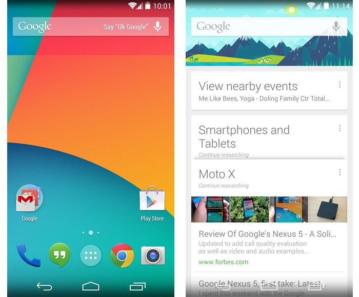
Visuals aside, Jelly Bean brought about our first taste of Google Now — the spectacular predictive-intelligence utility that's sadly since devolved into a glorified news feed. It gave us expandable and interactive notifications, an expanded voice search system and a more advanced system for displaying search results in general, with a focus on card-based results that attempted to answer questions directly.
Multiuser support also came into play, albeit on tablets only at this point, and an early version of Android's Quick Settings panel made its first appearance. Jelly Bean ushered in a heavily hyped system for placing widgets on your lock screen, too — one that, like so many Android features over the years, quietly disappeared a couple years later.
Android version 4.4: KitKat
Late-2013's KitKat release marked the end of Android's dark era, as the blacks of Gingerbread and the blues of Honeycomb finally made their way out of the operating system. Lighter backgrounds and more neutral highlights took their places, with a transparent status bar and white icons giving the OS a more contemporary appearance.
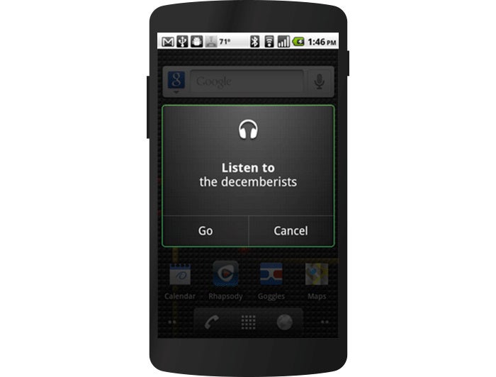
Android 4.4 also saw the first version of "OK, Google" support — but in KitKat, the hands-free activation prompt worked only when your screen was already on and you were either at your home screen or inside the Google app
The release was Google's first foray into claiming a full panel of the home screen for its services, too — at least, for users of its own Nexus phones and those who chose to download its first-ever standalone launcher.
Android versions 5.0 and 5.1: Lollipop
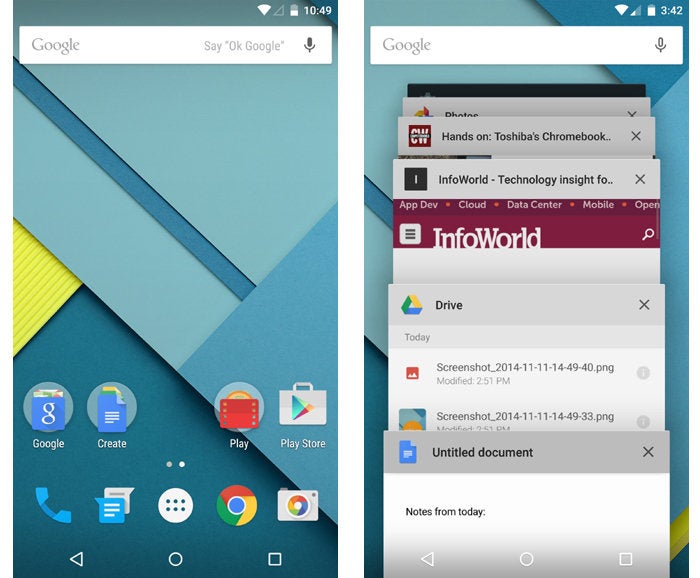
Google essentially reinvented Android — again — with its Android 5.0 Lollipop release in the fall of 2014. Lollipop launched the still-present-today Material Design standard, which brought a whole new look that extended across all of Android, its apps and even other Google products.
The card-based concept that had been scattered throughout Android became a core UI pattern — one that would guide the appearance of everything from notifications, which now showed up on the lock screen for at-a-glance access, to the Recent Apps list, which took on an unabashedly card-based appearance.
Lollipop introduced a slew of new features into Android, including truly hands-free voice control via the "OK, Google" command, support for multiple users on phones and a priority mode for better notification management. It changed so much, unfortunately, that it also introduceda bunch of troubling bugs, many of which wouldn't be fully ironed out until the following year's 5.1 release.
Android version 6.0: Marshmallow
In the grand scheme of things, 2015's Marshmallow was a fairly minor Android release — one that seemed more like a 0.1-level update than anything deserving of a full number bump. But it started the trend of Google releasing one major Android version per year and that version always receiving its own whole number.
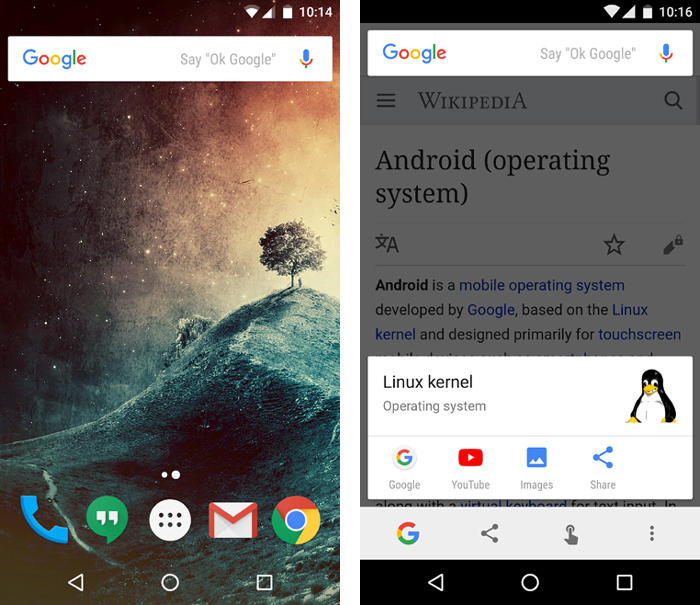
Marshmallow's most attention-grabbing element was a screen-search feature called Now On Tap — something that, as I said at the time, had tons of potential that wasn't fully tapped. Google never quite perfected the system and ended up quietly retiring its brand and moving it out of the forefront the following year.
Android 6.0 did introduce some stuff with lasting impact, though, including more granular app permissions, support for fingerprint readers and support for USB-C.
Android versions 7.0 and 7.1: Nougat
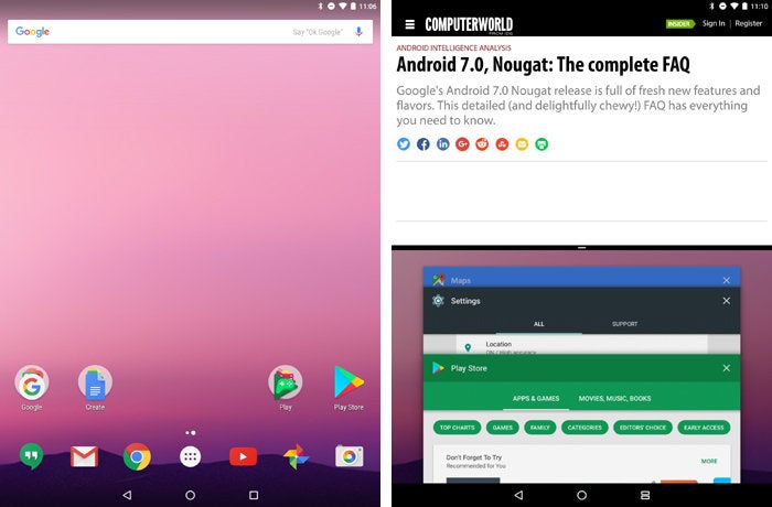
Google's 2016 Android Nougat releases provided Android with a native split-screen mode, a new bundled-by-app system for organizing notifications and a Data Saver feature. Nougat added some smaller but still significant features, too, like an Alt-Tab-like shortcut for snapping between apps.
Perhaps most pivotal among Nougat's enhancements, however, was the launch of the Google Assistant — which came alongside the announcement of Google's first fully self-made phone, the Pixel, about two months after Nougat's debut. The Assistant would go on to become a critical component of Android and most other Google products and is arguably the company's foremost effort today.
Android version 8.0 and 8.1: Oreo
And that brings us to 2017's Android 8.x Oreo release. Oreo adds a variety of niceties to the platform, including a native picture-in-picture mode, anotification snoozing option and notification channels that offer fine control over how apps can alert you.
Oreo also includes some noteworthy elements that further Google's goal of aligning Android and Chrome OS and improving the experience of using Android apps on Chromebooks — something likely to be an increasingly important focus in the months and years ahead.
Android 'P'
The yet-to-be-named (or numbered) Android P release is currently in apublic beta preview as Google gears up for its late-summer launch.
Things could still evolve between now and that final release. But at the moment, Android P's most transformative change is its wacky new gesture navigation system — which trades the traditional Android Back, Home and Overview keys for a single multifunctional Home button and a series of gesture-based commands.
Android P boasts numerous noteworthy new productivity features, too, including a universal suggested-reply system for messaging notifications; a more effective method of screenshot management; and more intelligent systems for power management and screen brightness control. The final software will also introduce a new series of "digital well-being" controlsintended to help with the ever-present challenge of balancing the digital and physical world.
The P release has plenty of under-the-hood improvements as well, including a variety of significant privacy and security enhancements. And the software sports a fair share of visual tweaks, such as an updated look for notifications and the neighboring Quick Settings panel and an ambitious series of added animations all throughout the interface.
According to Google's development timeline, Android P will see one more beta update in June and then two release candidates in the final weeks of testing. The software is then slated to make its official public debut sometime between July and September.





![ITEL A60 (A662L) FRP REMOVE FILE DOWNLOAD [A662L FDL]](https://blogger.googleusercontent.com/img/b/R29vZ2xl/AVvXsEiFbT8D8jS-OzP_EBv8z_KHso1MzdWxtJvtRaVqSor9SF5JfUhRuwU-mjcfaZ5Wzux6__FOgKkkmjotu8qQ41TFyFC2taOuStf3hbg1fEQV9GN6v4HRbZOwsnXdFewh2N3lif4Te8TFz_rhIWMi97lP0cosf3uQQVqkbPnBDLGr69e9Wx6bw9Vkh5K5JA/s72-w331-c-h400/Itel%20A60%20(A662L)%20frp%20remove%20file.jpg)


No comments:
Post a Comment